Charlotte Pan
" height="28px" id="ZqHE2J2u8" width="36px"/></svg>)

Responsive Web Design for Prostate Cancer Foundation Canada
Responsive Web Design for Prostate Cancer Foundation Canada
Responsive Web Design for Prostate Cancer Foundation Canada
Project Type
Project Type
User Flow Restructure, Visual Redesign, B2B
User Flow Restructure, Visual Redesign, B2B
Time
Time
Aug 2022 - Feb 2023
Aug 2022 - Feb 2023
roles
roles
UX Design,
Visual Design
UX Design, Visual Design
UX Design, Visual Design
tools
tools
Figma, Adobe Creative Suite, CorelDRAW
Figma, Adobe Creative Suite, CorelDRAW
outcome
outcome
Significantly Enhance
User Experience
Significantly Enhance
User Experience
Significantly Enhance
User Experience
compared to the previous website
compared to the previous website
20% Increase
in Total Donations
20% Increase
in Total Donations
20% Increase
in Total Donations
in 2024 compared to 2023
in 2024 compared to 2023
Project Background
Project Background
Formerly known as Prostate Cancer Foundation BC (PCFBC), PCFC is a grassroots nonprofit established in 1997 by prostate cancer patients. It plays a vital role in providing leadership and resources for prostate cancer support, awareness, and research across Canada.
In 2023, PCFC underwent a significant rebrand—expanding its scope nationally and unifying three previously distinct subgroups.
Project Goals
Project Goals
A freshly-looking, well-structured and much user-friendly website was required to reflect PCFC’s new branding and integrated services.
A freshly-looking, well-structured and much user-friendly website was required to reflect PCFC’s new branding and integrated services.
My Role
My Role
Reorganize as well as restructure all resources and contents for a better navigation.
Improve the donation process and experience.
Design a compelling website interface to reflect PCFC’s new branding.
Reorganize as well as restructure all resources and contents for a better navigation.
Improve the donation process and experience.
Design a compelling website interface to reflect PCFC’s new branding.

Information Architecture
Information Architecture

Challenges & Solutions
Challenges & Solutions
Challenge 1
Challenge 1
The previous site had a main header bar and separate in-text submenu tabs on each page, leading to a clunky and unintuitive navigation experience.
The previous site had a main header bar and separate in-text submenu tabs on each page, leading to a clunky and unintuitive navigation experience.
Previous Design
Previous Design

Solution to Challenge 1
Solution to Challenge 1
I created a unified 3-level dropdown menu within the main header for desktop and tablet. For mobile, I implemented a sliding 3-level menu from the left side, providing a more intuitive and accessible navigation structure.
I created a unified 3-level dropdown menu within the main header for desktop and tablet. For mobile, I implemented a sliding 3-level menu from the left side, providing a more intuitive and accessible navigation structure.
New Design
New Design


Challenge 2
Challenge 2
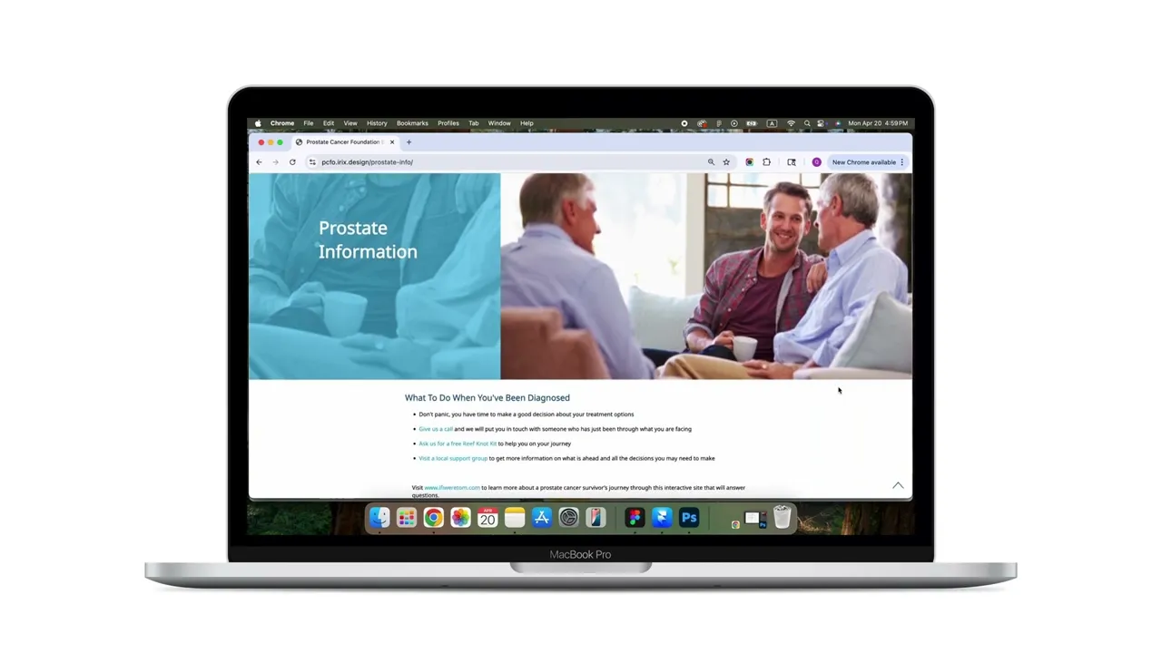
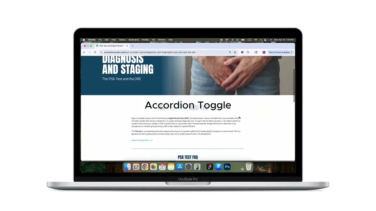
The Facts & Resources section offered minimal information, forcing users to contact support or search externally for details.
The Facts & Resources section offered minimal information, forcing users to contact support or search externally for details.
Previous Design
Previous Design
Solution to Challenge 2
Solution to Challenge 2
We expanded the section with in-depth content including articles, videos, and guides. Key improvements included:
A search bar in the top-right header for site-wide keyword search.
Expandable content toggles within resource pages, allowing users to easily scan and access relevant sections.
A dropdown filter in the video library to help users find content quickly without excessive scrolling.
New Design
New Design
Challenge 3
Challenge 3
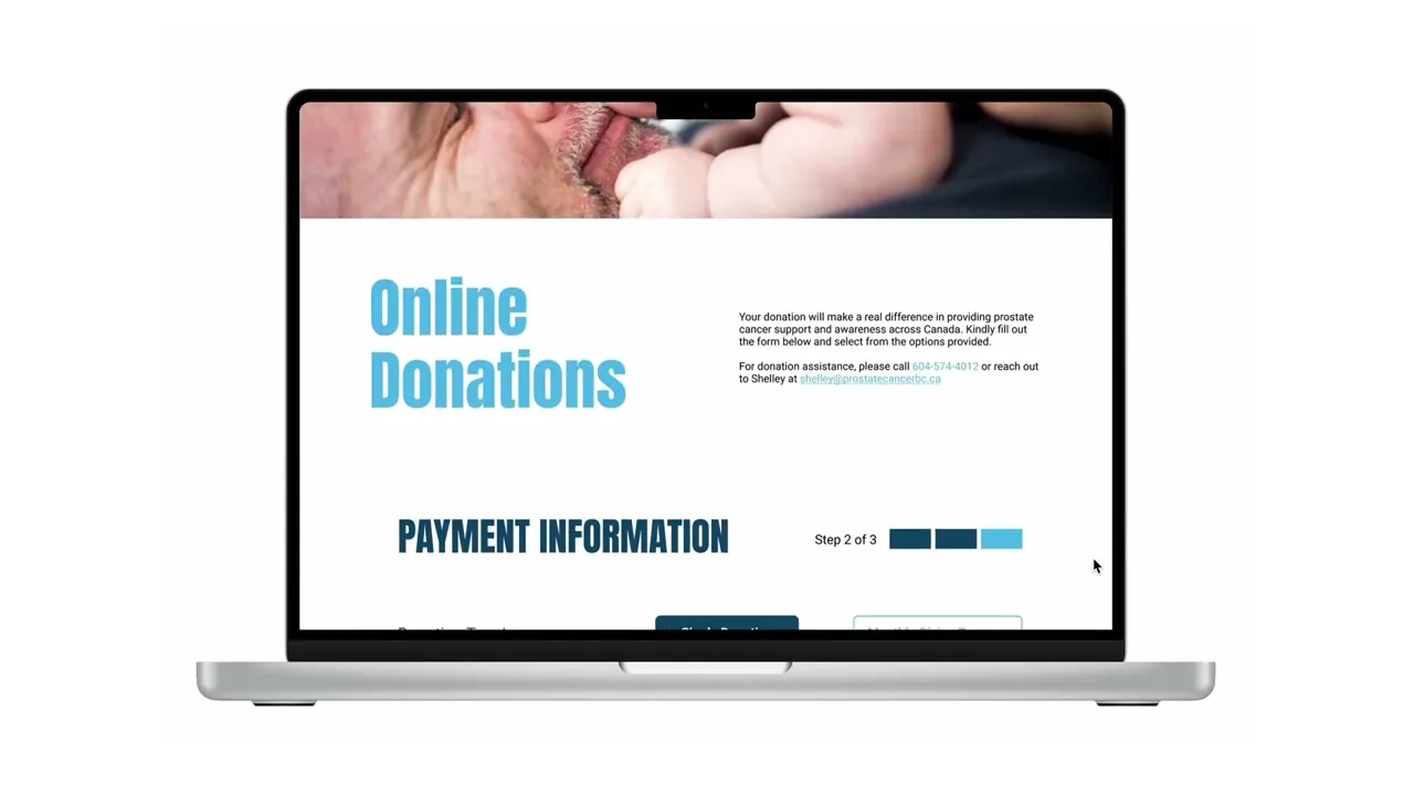
The donation form was a single page. And there was no dedicated Thank You page, which could leave users uncertain about whether their donation was successful.
The client would like to add more information to be filled in the form. If we kept the page being a single page, the page would be very long - especially for mobile users.
Previous Design
Previous Design
Solution to Challenge 3
Solution to Challenge 3
I redesigned the donation user flow into a clear 3-step process after selecting donation types as "Donate Online":
Contact information
Payment information
Gift Details
I also introduced a dedicated Thank You page, giving users immediate confirmation and a sense of appreciation for their contribution.
Redesigned User Flow
Redesigned User Flow

Prototype
Prototype
Usability Testing & Insights
Usability Testing & Insights
Who Had Joined the Testing?
Who Had Joined the Testing?
Members from both design team, programming team and PCFC team
Friends and families
Members from both design team, programming team and PCFC team
Friends and families
Tasks
Tasks
Make a one-time donation as a gift and send a thank-you email.
Find information on nutrition for prostate cancer patients.
Locate a support group in Kelowna.
Identify the process to apply for a cancer research grant.
Look up details on upcoming events.
Make a one-time donation as a gift and send a thank-you email.
Find information on nutrition for prostate cancer patients.
Locate a support group in Kelowna.
Identify the process to apply for a cancer research grant.
Look up details on upcoming events.
Insights
Insights
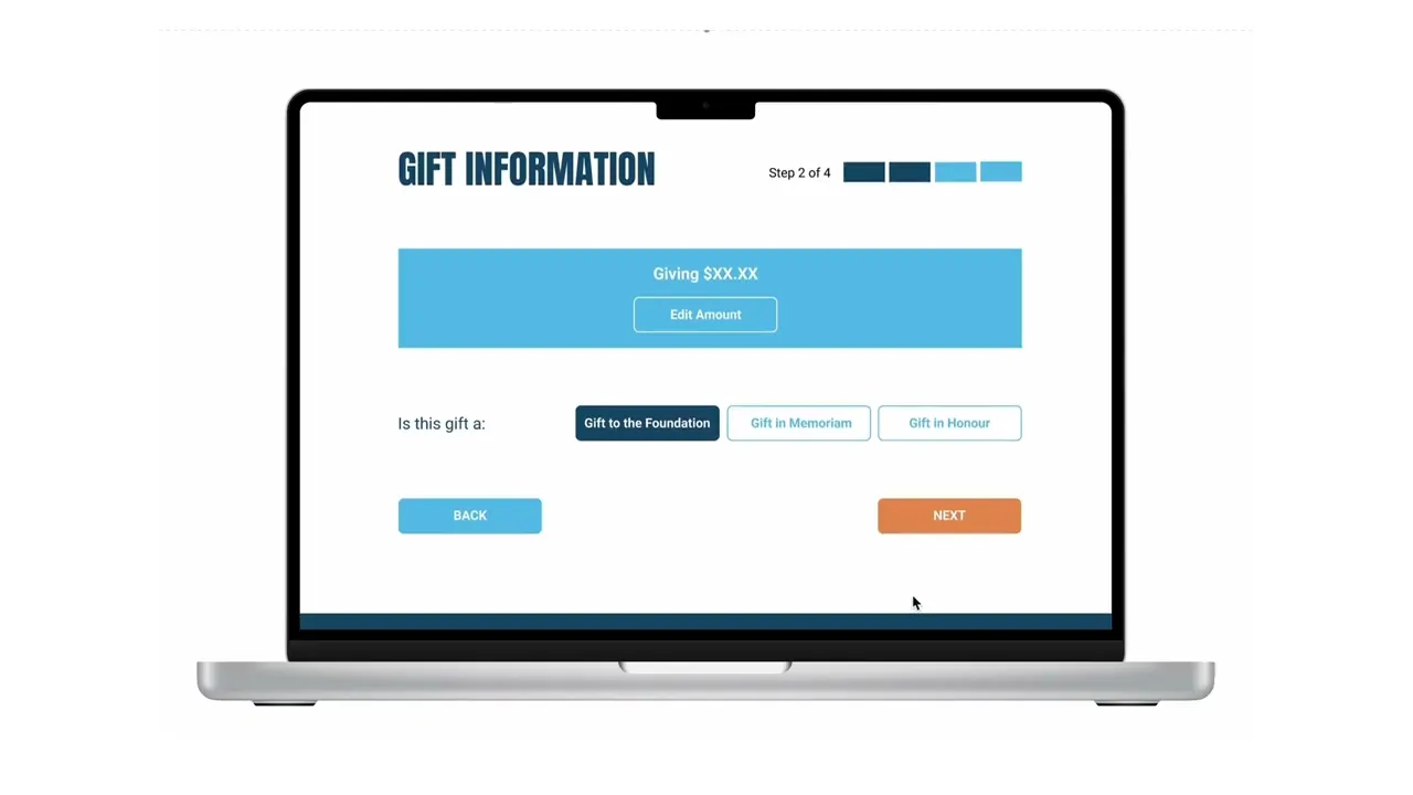
All users reported significantly improved navigation.
The new multi-step donation form was clearer and more user-friendly.
Many wanted to review donation amounts before submitting.
The clients would like to add further more details to be filled in gift sections.
Users wanted more detailed event information before registering.

Iteration on Donation Flow
Iteration on Donation Flow
Iteration on Donation Flow
Iteration on Donation Flow
Furtherer split the donation flow.
Added in “Edit” button at the top of each step for quickly review or change the donation detail.
Changed colours to the “Next” and “Submit” buttons.
Furtherer split the donation flow.
Added in “Edit” button at the top of each step for quickly review or change the donation detail.
Changed colours to the “Next” and “Submit” buttons.
Iterated User Flow
Iterated User Flow

Prototype after Iteration
Prototype after Iteration
Design System
Design System
Typography
Typography
Anton
Headlines
Headlines
Roboto
Body & CTA
Body & CTA
Color Palette
Color Palette
buttons
buttons
CTA to donation
CTA to donation
Default
Mouse Hover
Pressed
other CTA Tabs
other CTA Tabs
Default
Mouse Hover
Pressed
tabs
tabs
Primary CTA Button
Primary CTA
Button
Default
Mouse Hover
Pressed
Accordion Toggle
Expand
Expand
Fold
External Link
External Link
Default
Mouse Hover
Pressed
Final Delivery
Final Delivery
Visit the live site of the new PCFC website ➡️ https://prostatecanada.ca/
Visit the live site of the new PCFC website ➡️ https://prostatecanada.ca/
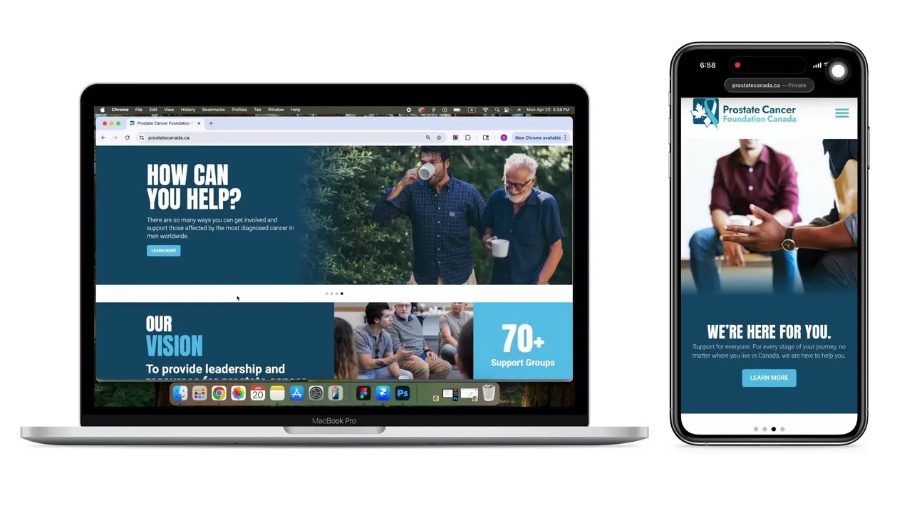
Homepage Mockup
Homepage Mockup
Let's build
something magical together.
Get In Touch
Let's build
something magical
together.
Get In Touch
Let's build
something magical together.
Get In Touch
© 2026 Charlotte Pan’s Portfolio. ALL RIGHTS RESERVED
© 2026 Charlotte Pan’s Portfolio. ALL RIGHTS RESERVED